


It’s an iconic symbol – so iconic almost everyone in the Western Hemisphere knows what it means. Billions of other people, too.
But apparently some folks have had it with the marijuana leaf. Seven points, five points, or three, trademark expert and blogger James I. Bowie says it’s time to give up on this ancient, pervasive visual shorthand for cannabis and the people who use it.
“Enough with the Pot Leaves,” announces the Slate headline over a post written by Bowie in April. “Marijuana Branding Needs a Makeover.” And that’s not all, Bowie says: It’s time to jettison every half-assed stab at creativity with “Canna-something” or “Mari-whatever” in its name.
The man has a point. The odd-pronged leaf is ubiquitous, but it is a little old, and often quite stale as advertising goes. It’s also hard to get away from: Fully 44 percent of new products involving weed use the simple green leaf, Bowie reports.
“By 2015, more than 1 in 500 new U.S. logos featured a cannabis leaf,” he writes.
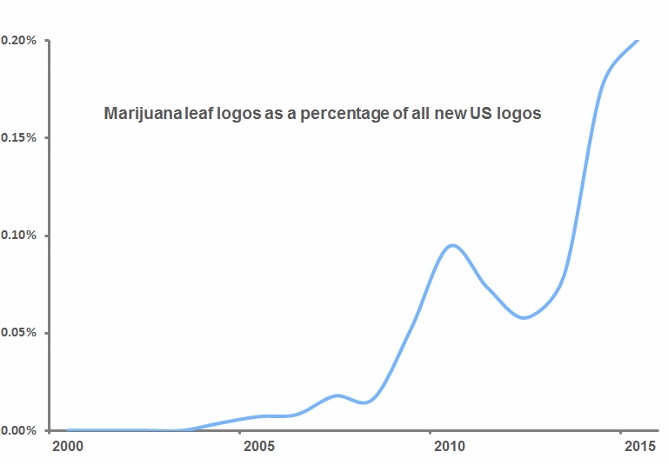
That’s a lot, even for an increasingly popular industry that has exploded in recent years. If booze concerns sold every one of their products using the image of a brown jug labeled “XXX,” people would quit vodka en masse. But there are also reasons to stand up for the pot leaf.
An icon that customers can identify
For one thing, simplicity often speaks volumes more than originality. The basic outline of a cannabis plant suggests something almost everyone can identify, immediately: good grass. It stands for the drug and every product related to it, true, but it also represents a political point of view, a cultural sensibility, and a tight-knit community.
What’s more, it isn’t quite as simple as “too much leaf.” Businesses that sell marijuana directly, whether medicinal dispensaries or recreational pot shops, do tend to stick the supposedly tired icon on anything and everything they offer. But others, including the good folks who serve growers, processors, and shippers, typically avoid the ubiquity of the leaf. You’d be hard-pressed, for example, to find a garden supply store than advertises explicitly as a place to get equipment for growing marijuana.
And even when providers use the leaf without abandon, they’re getting a deeper message across: Legal weed is here to stay. Plus, stoners are hardly alone in their over-reliance on simple imagery. As Bowie himself notes, more than half of veterinarians use logos featuring animals, while barbers use striped poles, dentists teeth, and Realtors houses.
Still, Bowie argues, a better approach is needed as legal cannabis expands into the mainstream. Not every customer wants to join in the pothead rebellion, he says, and the industry needs a more subtle means of appealing to the buttoned-down crowd.
“If you need a quick haircut or your molar is killing you, you’ll look for the first striped pole or tooth logo you can find,” he writes. “Because legal pot is still a novelty, the leaf itself is enough to attract business. But as marijuana becomes legally available on a more widespread basis, its branding is going to have to move beyond the generic leaf to incorporate more distinctive visual elements.”


